TL;DR: Chess wardrobe color theory starts at the board: black, white, grey, plus one disciplined accent. Contrast creates structure; accents create personality. Avoid competing brights that moiré on camera or clash under fluorescent hall lights.
Board palette as wardrobe grammar
Light and dark squares map to shirts and trousers: value contrast does the work. When both pieces are mid-tone, outfits flatten. When contrast is crisp, you look intentional without any chess print. Grey is the third rank—connects extremes like a well-placed minor piece.
Navy functions as near-black in many indoor lights—often softer and more flattering than pure black, which can drain faces under greenish fluorescents common in school venues.
White and near-white choices
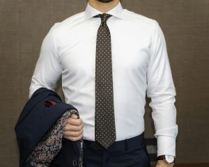
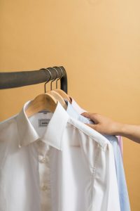
Optical white shirts photograph high-key on stream; off-white or light blue reduces glare. White trousers are brave at tournaments—coffee and chair dust exist. Keep white dominance above the waist for practicality.
Winter white flannel shirts add seasonal variety without breaking monochrome story. Summer white linen requires acceptance of wrinkles or blending with linen-cotton.
Black and charcoal deployment
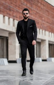
Charcoal trousers daily; black for formal edges and evening events. All-black outfits need texture variation—matte knit with slight sheen blazer—to avoid funeral vibe. Black shoes anchor most combinations; brown adds warmth and pairs better with navy-heavy wardrobes.
Black blazers show lint and dust—carry clothes brush in tournament bag if you wear them often.
Accent colors that respect the game
Burgundy, forest green, rust, and deep teal complement monochrome without screaming. Use one per outfit: socks, tie, pocket square, watch strap. Burgundy reads classic chess club; green reads collegiate; rust reads autumn travel circuit.
Bright red and electric blue compete with alert icons on streaming layouts—avoid if you overlay graphics near your video feed. Pastels suit spring casual clubs but can read juvenile in corporate simuls—context again.
Undertones and skin harmony
Cool undertones often suit blue-greys and pure white; warm undertones suit ivory, olive, and brown leather. Testing under venue lighting beats testing in bathroom mirror alone. Shirt collar near face is the critical color relationship.
Do not force trendy accents that clash with complexion—confidence at board drops when you feel “off” in mirror glimpses.
Building a color roadmap
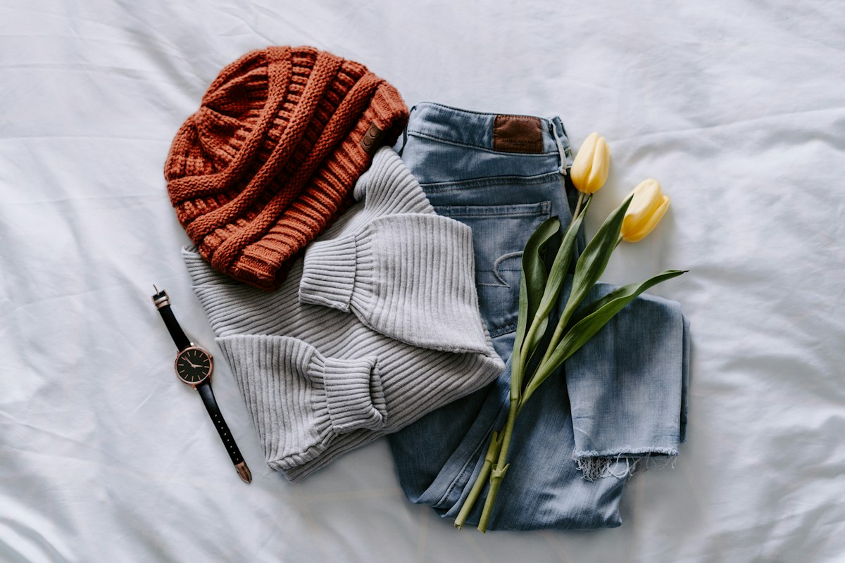
Inventory closet by value: count light, mid, dark pieces. Fill gaps before buying fifth navy blazer. Plan accent family for season—one purchase at a time. Photograph combinations flat on bed; bad combos obvious before packing.
Curated palettes at Chess Menswears reduce guesswork—start from their monochrome-plus-accent bundles when rebuilding wardrobe coherence.
Photography and print color drift
Event photographers edit warm; your navy may read purple in print. Slightly neutral charcoal safer if you hate color surprises in federation yearbook.
Team jackets in loud colors clash with personal monochrome—wear team zip-up to venue, remove for board if colors fight your palette in photos you care about.
Streaming color settings differ from still photos—test both if you do hybrid media career.
Accent repetition across wardrobe
Choose one accent color for season—burgundy fall, olive spring—and repeat in socks, tie, watch strap for coherence without new purchases each month.
Too many accents in one closet creates decision fatigue; capsule accent discipline simplifies morning pairing before early round.
Monochrome photography tests
Before big event, phone photo yourself in bathroom mirror under fluorescent and warm bulb—two common venue types. If outfit fails one light, swap piece before packing final bag.
Team uniform versus personal palette
College or corporate team jackets may clash with personal monochrome—wear for team photo, swap to personal blazer for individual board if colors fight concentration. Negotiate with captain early season avoids mid-tournament drama.
Accent color in team logo can inspire personal sock choice—cohesion without full costume match.
Colorblind-friendly outfit checks
Ask friend verify navy versus black match in dim light if color vision uncertain—mismatch invisible to you reads sloppy to others. Phone camera desaturate filter preview helps simulate opponent view across board.
Wardrobe decisions compound across a chess season the way small positional edges compound across a tournament. Log what worked, alter what almost worked, and retire what fought you at the board. That discipline costs less than replacing the same mistake every registration cycle.
Wardrobe decisions compound across a chess season the way small positional edges compound across a tournament. Log what worked, alter what almost worked, and retire what fought you at the board. That discipline costs less than replacing the same mistake every registration cycle.
Wardrobe decisions compound across a chess season the way small positional edges compound across a tournament. Log what worked, alter what almost worked, and retire what fought you at the board. That discipline costs less than replacing the same mistake every registration cycle.
Wardrobe decisions compound across a chess season the way small positional edges compound across a tournament. Log what worked, alter what almost worked, and retire what fought you at the board. That discipline costs less than replacing the same mistake every registration cycle.